Tuesday, February 14, 2012

IAMM Field Trip [ DSM3 ]

1. Initial statement of IAMM is to let people understand the knowledge of Islamic Art and history. 

2. The audience of IAMM will fulfill needs by understanding in depth knowledge about history of Islamic Art in Malaysia. Besides that, there also got many different countries's art and history and in different form like their costume, weapon, coin, textile, manuscript....etc. The audience will be able to understand         what is the unique of artefacts and their sources and so on.

3. The kind of mood has been created comfortable, silent and clean. At the beginning part I was excited and interesting to read through all the information on the board are display and took picture, but the along while I was very tired , bored and lazy to read through all the information, there got a lot of things to see and read, but not everything are really understanding, if got interactive media, I think will be better and wouldn't  be so bored.

4. The most I curious is the Malay's coins with central holes, before I know this, I thought coins with central holes is only existed in China. But then actually another form of Malay coin design has at its centre a hole, it can be either round or square. Besides that central holes, their coins shapes are really similar with Chinese copper cash, but inscription are different , like kelatanese coins the name of the state is written on the obverse, with the month and year of minting on the reverse, but in Petani, the title of the ruler will appears on both sides.

5. My first impression towards Islamic Art is boring, because I thought here is just display all about Malaysia, but actually no, there also got many others countries's history and art, it is interesting and also my impression is got  a lot of knowledge here, but I cant recall back all, only remember what I interested one, like China history and Malay's coins.

6. 
Q1: When Islamic Art spread into Chinese culture?
Q2: How to distinguish the different coins but their design and size is the same?
Q3: Islamic art will be the impact for the future? 

Sunday, September 11, 2011

Club Monaco's Competitor


Analysis :
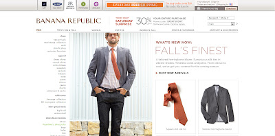
The website has a dark layout which makes look very elegant and prestige. The pages are easy to surf through and it has a sleek animation effect which captures attention. The shirt brings out the matureness of the models which shows that it is more serious and superior itself.

****************************************************************************************


Analysis : The color of the background is white and gives a more bright and easy going effect. It shows that the brand is more easily accessible to the public. It has its own unique style which brings out the beauty of nature and not complicated designs.

****************************************************************************************


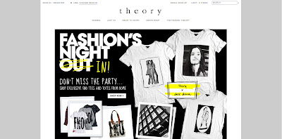
Analysis : The background color is black which adds a sense of mystery. The entire design gives it a more prestige feeling and makes you feel more different wearing their clothes. It makes lay people dress like a model which makes it more stylish.

 ****************************************************************************************


Analysis : The background color used is white but it does not bring out an easy going feeling. However the layout seems to be too simple and the shirts were not worn by models so it lacks the human touch on it which makes it feel more distant.


Beautiful Website


 I like the most is the round shape design, it make me felt simple but nice.
Besides that, i also love the navigation effect, like when your mouse over there, 
it have sound effect and behind will change different images.


Actually I not really like inside page, because too many colour...
compare with main page not felt like really consistency...


*****************************************************************************


 I like this website is because the art style and color mood>>> vintage style:)....
and the typeface and navigation are clear to read:)

*****************************************************************************


This is another style I like ~ 
this website is use image and video to show the product detail ,
 make the website not too boring, overall looks noble :) 

*****************************************************************************


This is this the fashion, perfume and cosmetic website~
I love this brand very much too :)
The most I like is the art style, because it felt like a interactive games,
it is interesting way to show the information, that nice ^^