Analysis :
The website has a dark layout which makes look very elegant and prestige. The pages are easy to surf through and it has a sleek animation effect which captures attention. The shirt brings out the matureness of the models which shows that it is more serious and superior itself.
****************************************************************************************
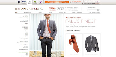
Analysis : The color of the background is white and gives a more bright and easy going effect. It shows that the brand is more easily accessible to the public. It has its own unique style which brings out the beauty of nature and not complicated designs.
****************************************************************************************
Analysis : The background color is black which adds a sense of mystery. The entire design gives it a more prestige feeling and makes you feel more different wearing their clothes. It makes lay people dress like a model which makes it more stylish.
****************************************************************************************
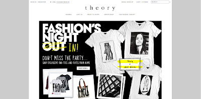
Analysis : The background color used is white but it does not bring out an easy going feeling. However the layout seems to be too simple and the shirts were not worn by models so it lacks the human touch on it which makes it feel more distant.


No comments:
Post a Comment